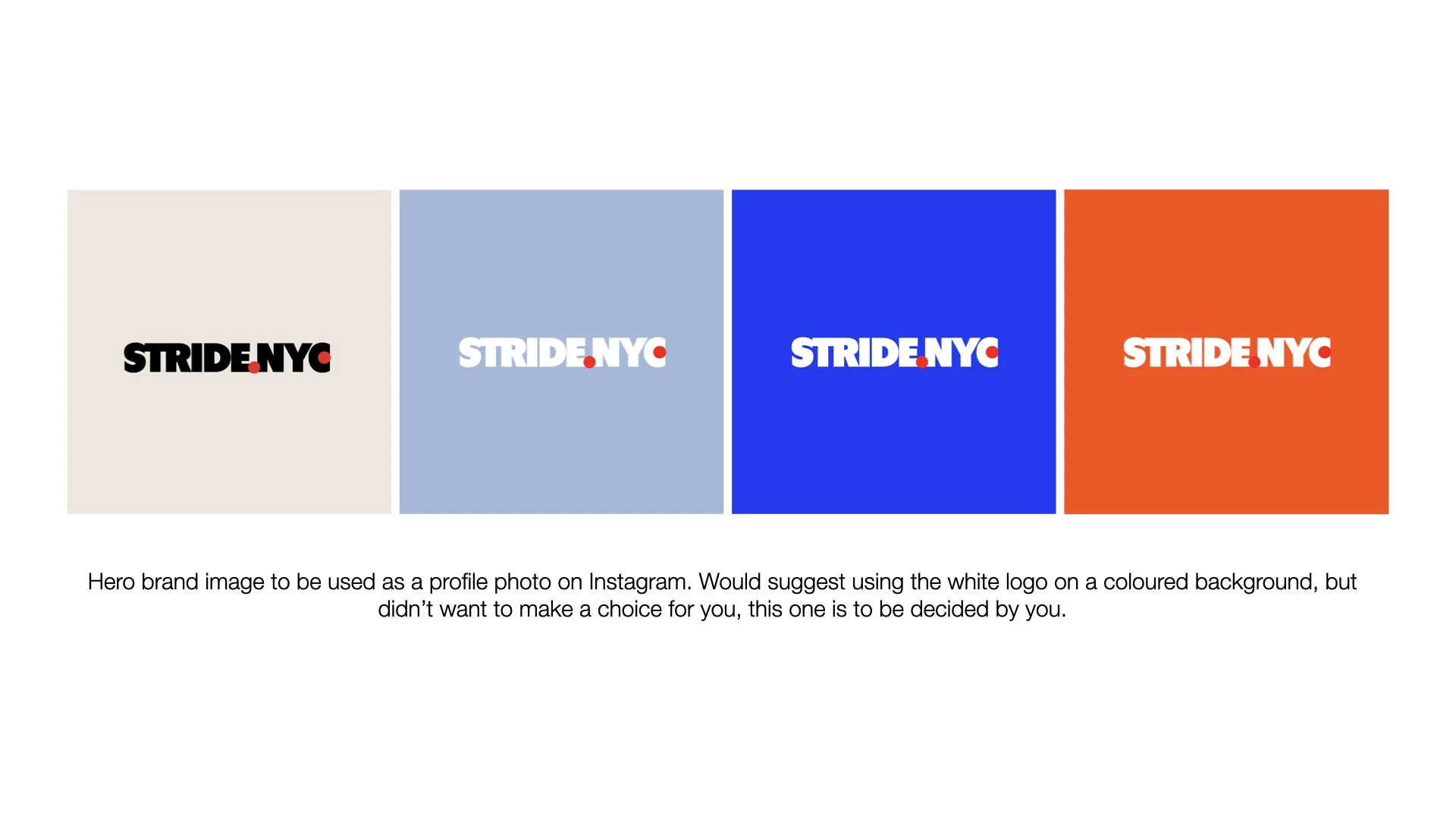
STRIDE.NYC is a lifestyle and movement-focused community built around walking, health, and connection in New York City. The goal of the project was to create a bold, recognisable brand identity and a flexible system of social media templates that could grow with the community and be easy to use day to day. The logo concept draws directly from the visual language of New York itself. By referencing the instantly recognisable colours of the “I ❤️ NY” symbol, the brand taps into a shared cultural memory, making STRIDE feel familiar from the start. The two red dots in the logo represent movement - a simple visual metaphor for getting from point A to point B, one step at a time.
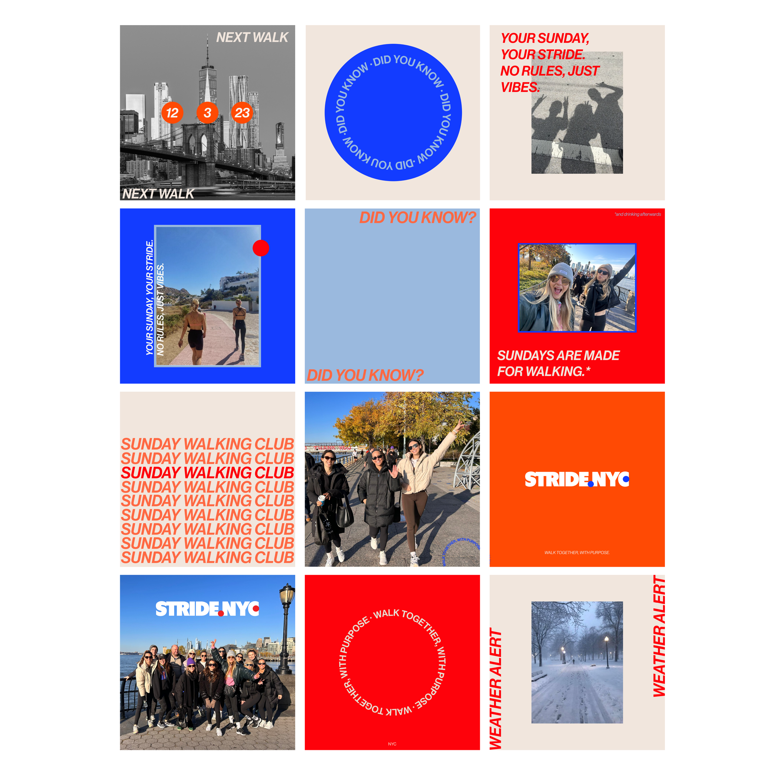
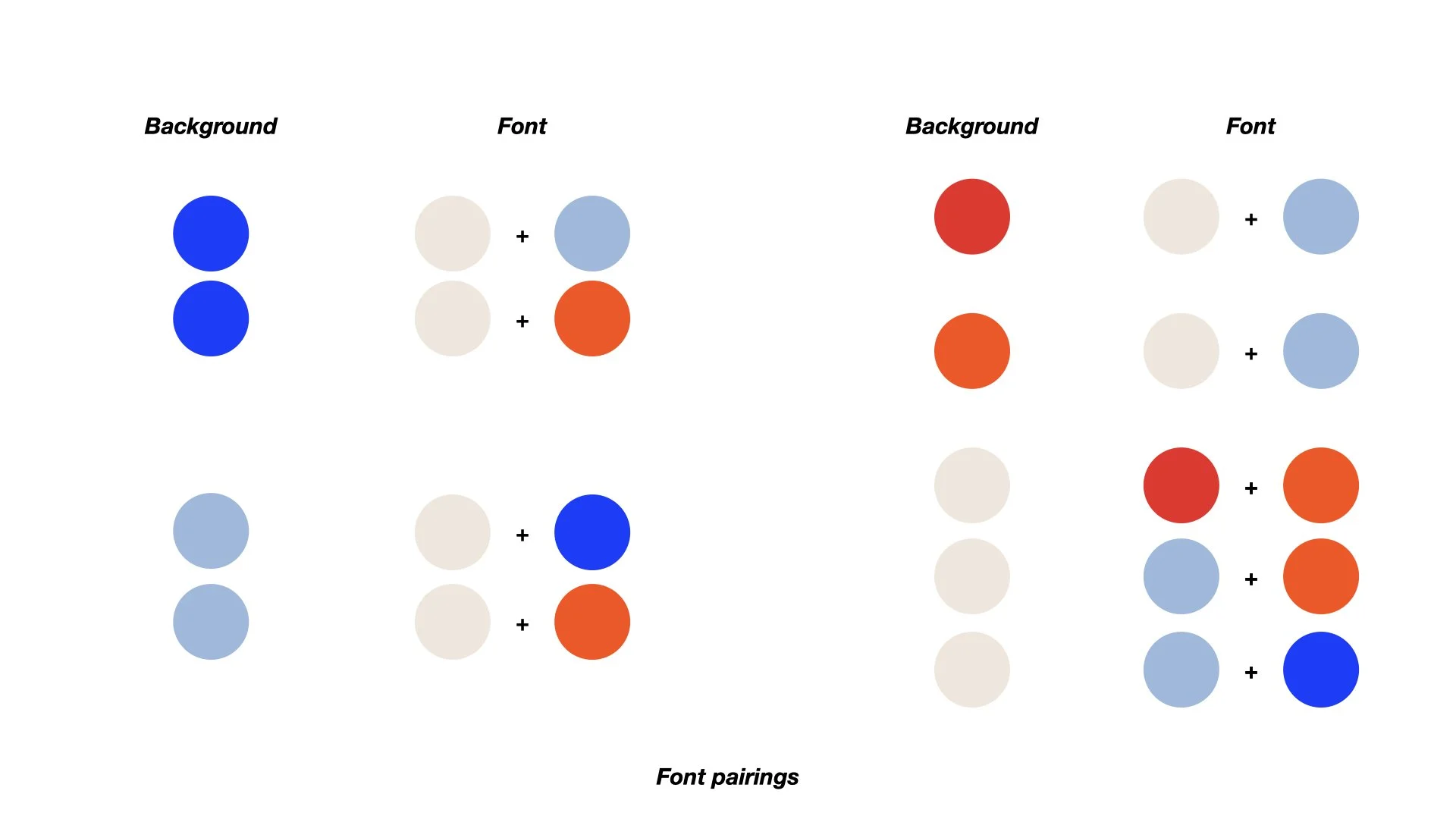
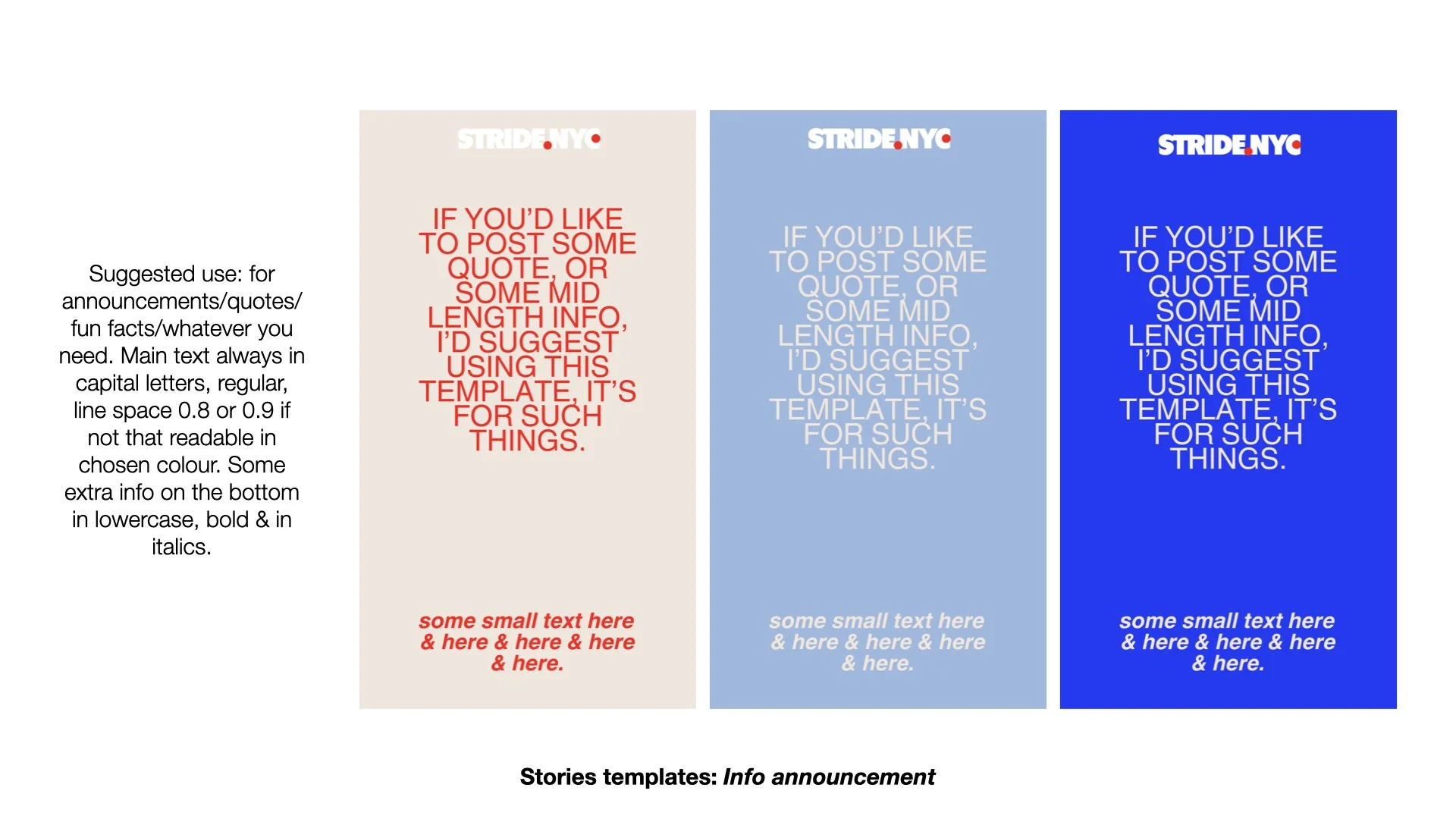
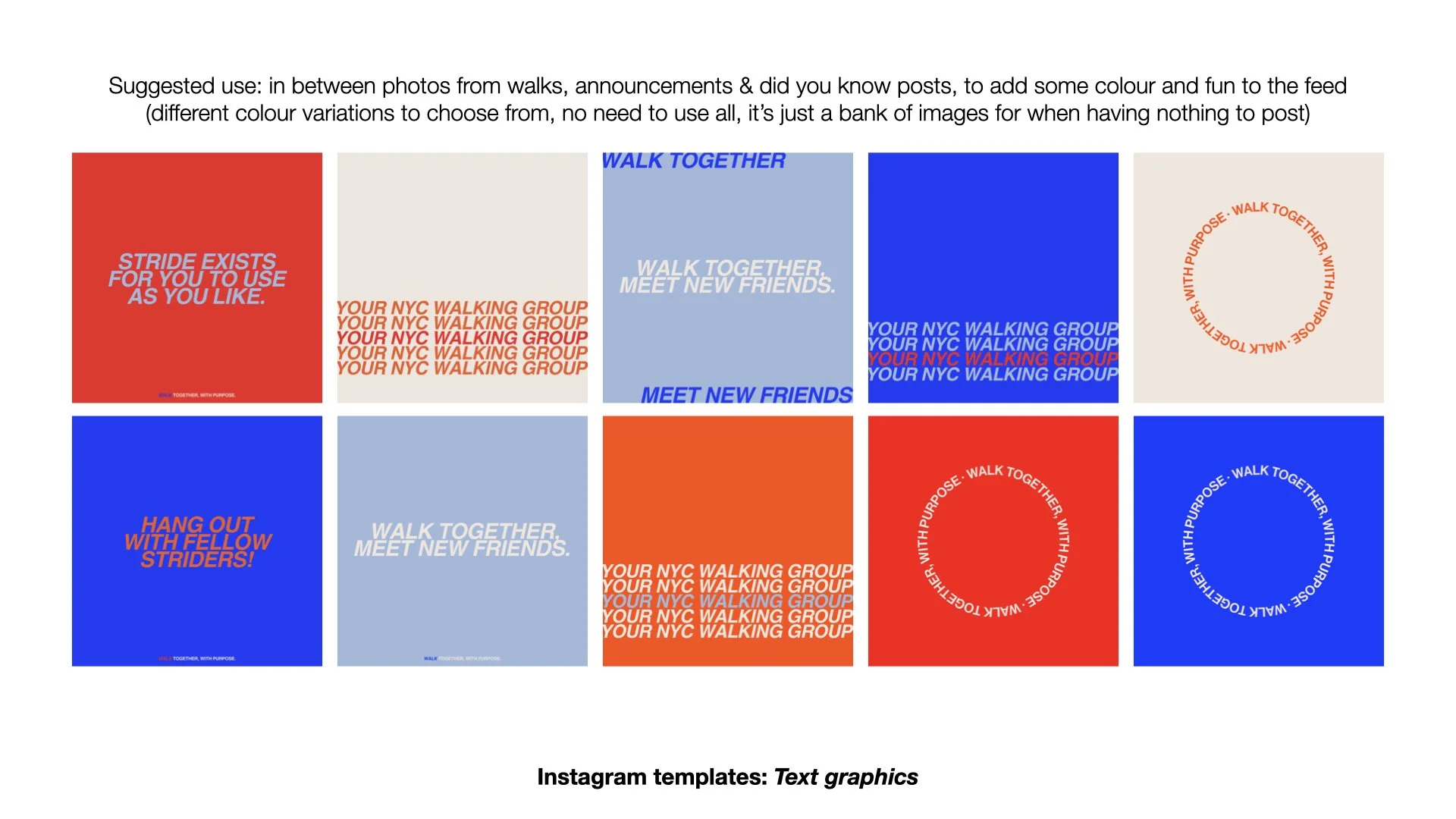
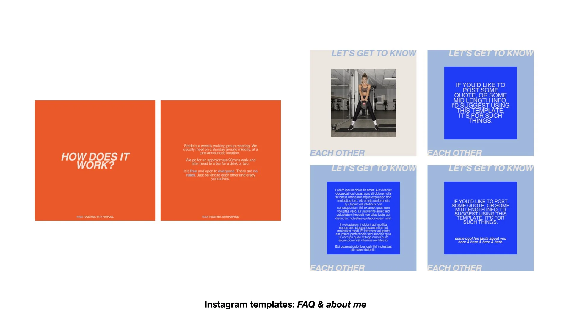
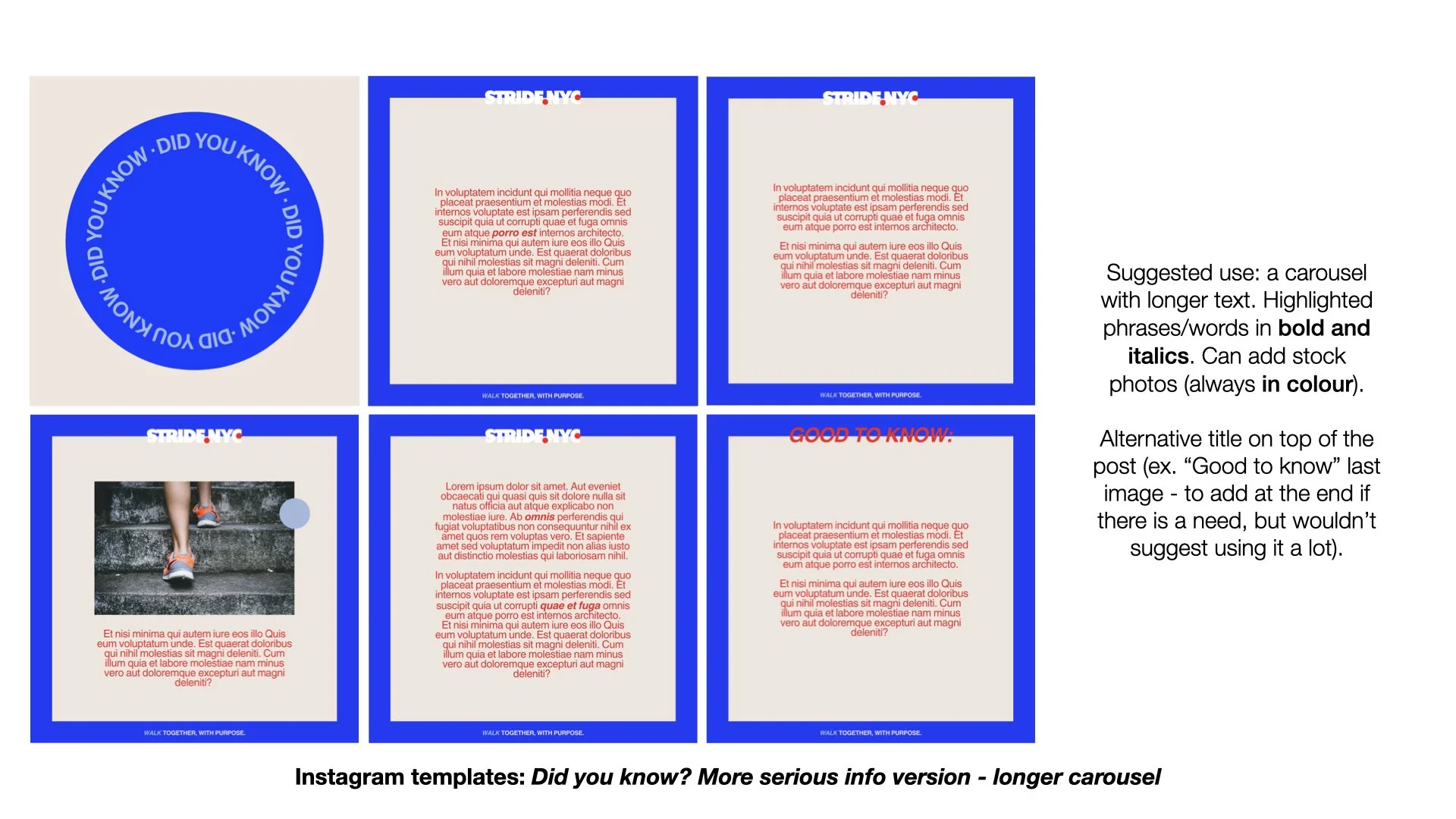
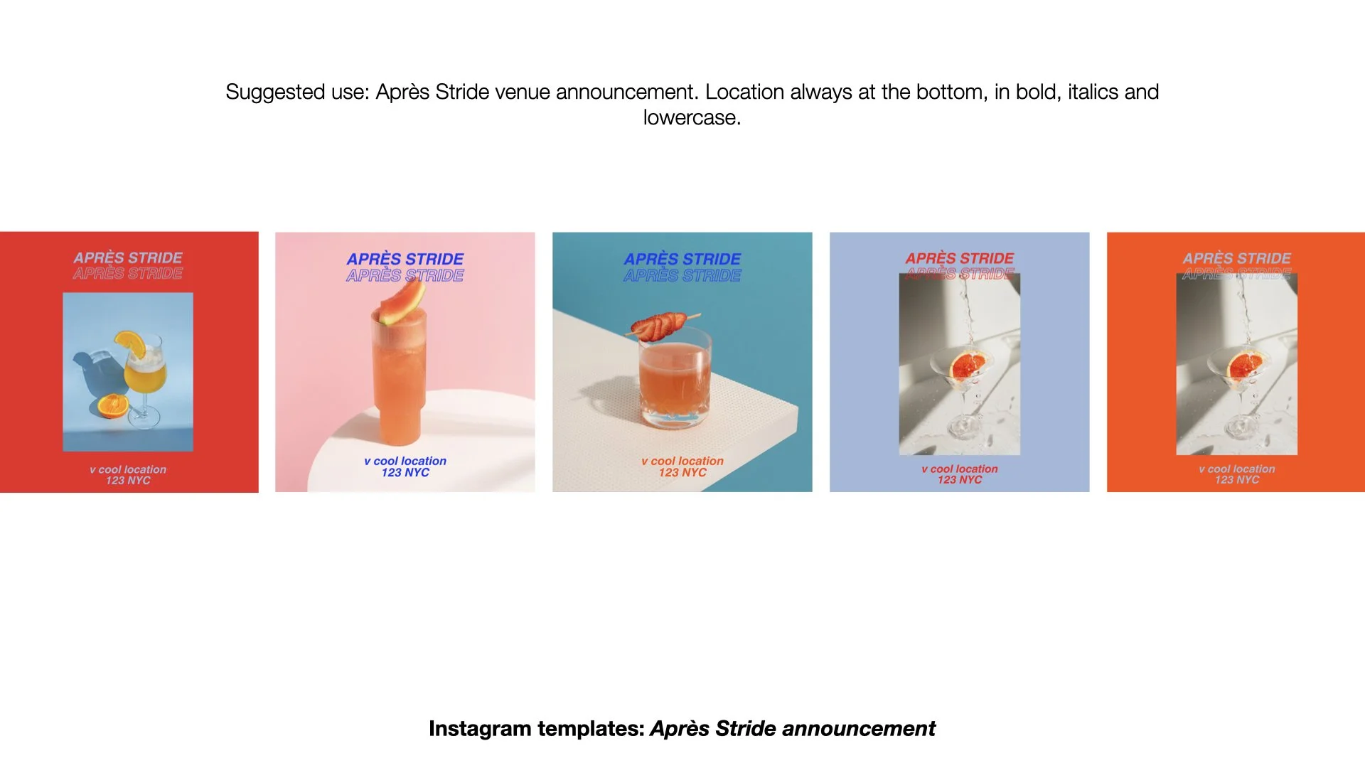
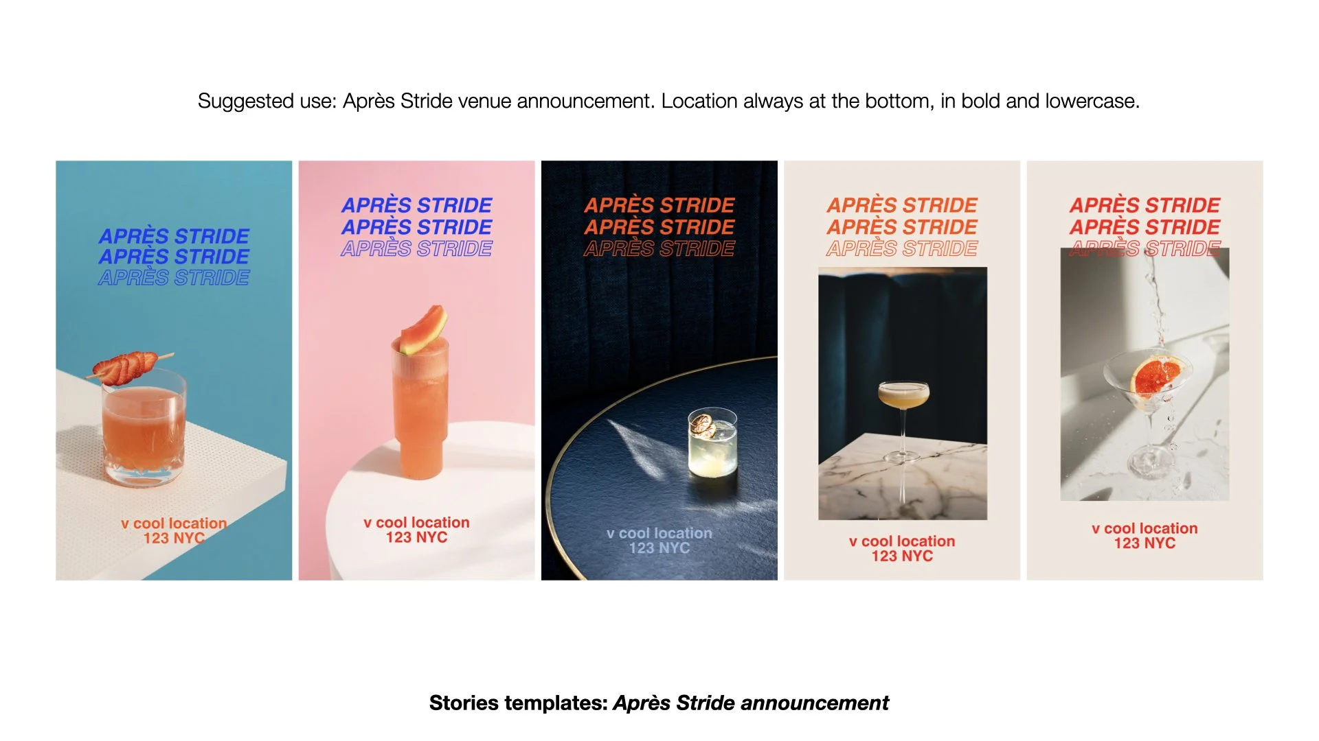
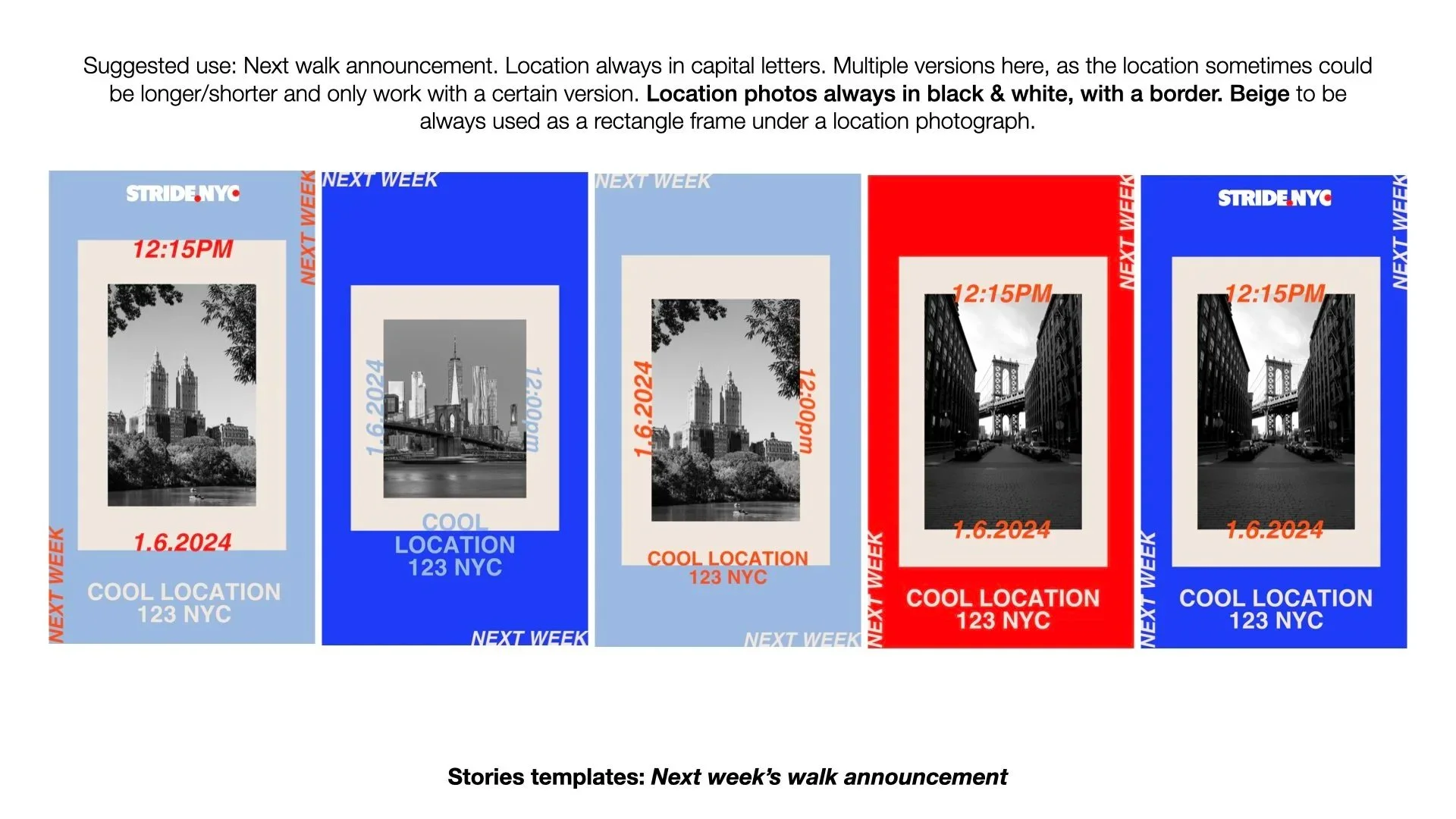
The wider brand system balances energy and clarity: strong typography, a vibrant but controlled colour palette, and modular layouts designed specifically for social media. Templates were created for walks, announcements, weather updates, Aprés Stride meetings and community content, ensuring consistency while leaving room for spontaneity and real moments.